nemlig.com
At nemlig.com I make product design and new features for web and our two apps, prototype for user tests, help develop and maintain a design system and also contribute to the corporate identity.
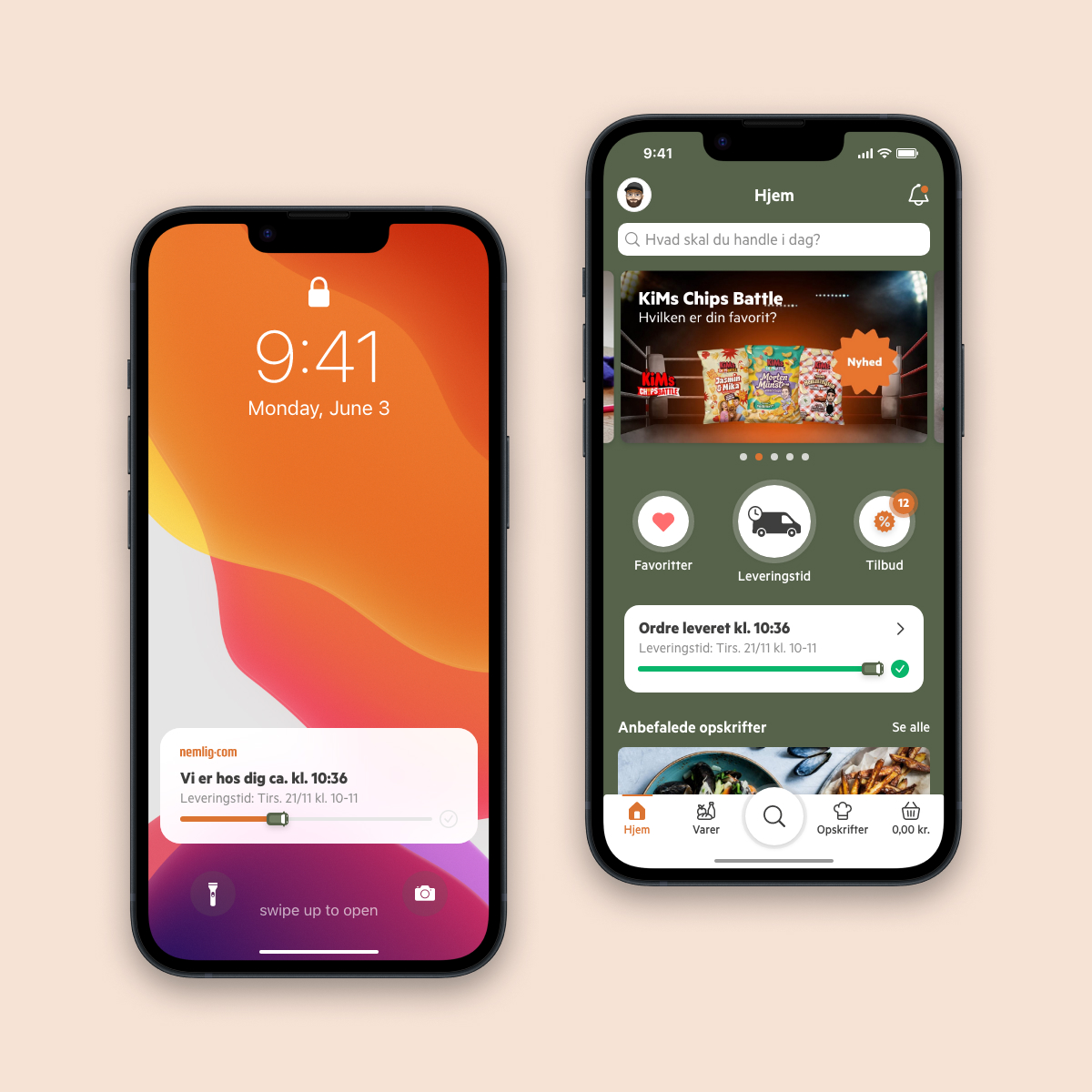
Order ETA
The cheaper time slots with long intervals tend to make customers call customer service, since they are only sent one text message with an ETA on the day of delivery.
Solution
Inspired by the Live Activities functionality in iOS could we use something like this to keep customers continuously updated? Do we have the data on the route to do so? It turns out we do have all the data needed and that it's possible. Also on Android. I then designed the feature so that it could work for those with live activities on the lock screen turned on and so that it could be displayed in the app on the home screen as well. I also wanted the feature to be engaging and fun to watch so I made a progress bar with a small delivery truck.
Result
Virtually no more calls for customer service regarding ETA of orders for mobile users.
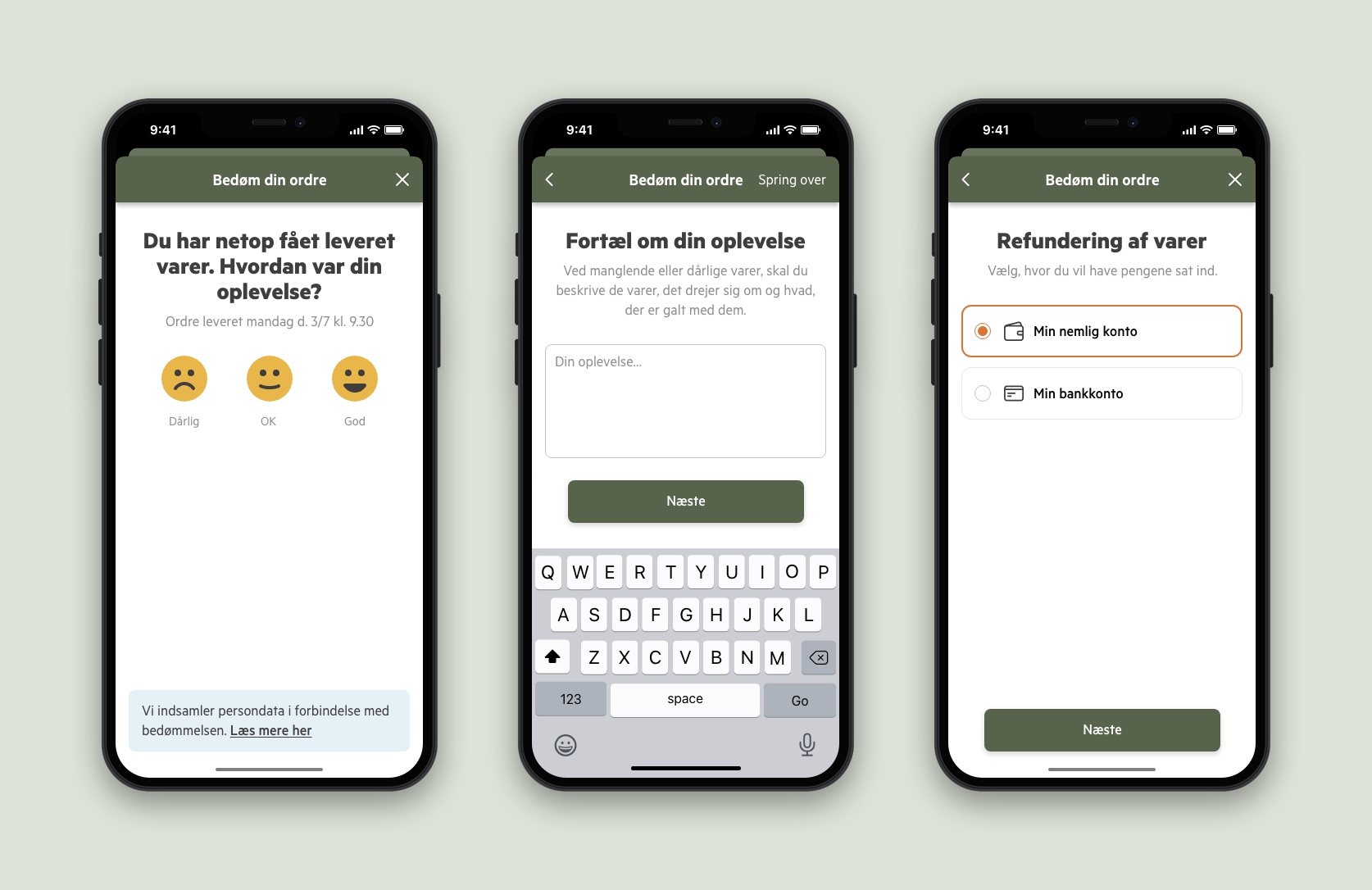
Rate your delivery
We want happy customers so it's crucial to know what they think about our service. What is the best way to get that information from the customers and when?
Solution
A good time for that is when the customer's order has just been delivered. The product owner and I made a concept which I then made as a prototype. When an order has been delivered the customer is asked to rate the delivery. If the delivery was good the customer is encouraged to rate the experience on Trustpilot. If the delivery was OK or bad the customer can choose from a set of categories before being asked about the experience. It's also possible to choose to get a call from customer service. If products are missing or not okay the customer can choose to get a refund to their account or credit card.
Result
This is still a working concept so far but the hypothesis is that most customers will use this rather than call customer service unless something has gone seriously wrong. A next step could also involve a true self-crediting feature.
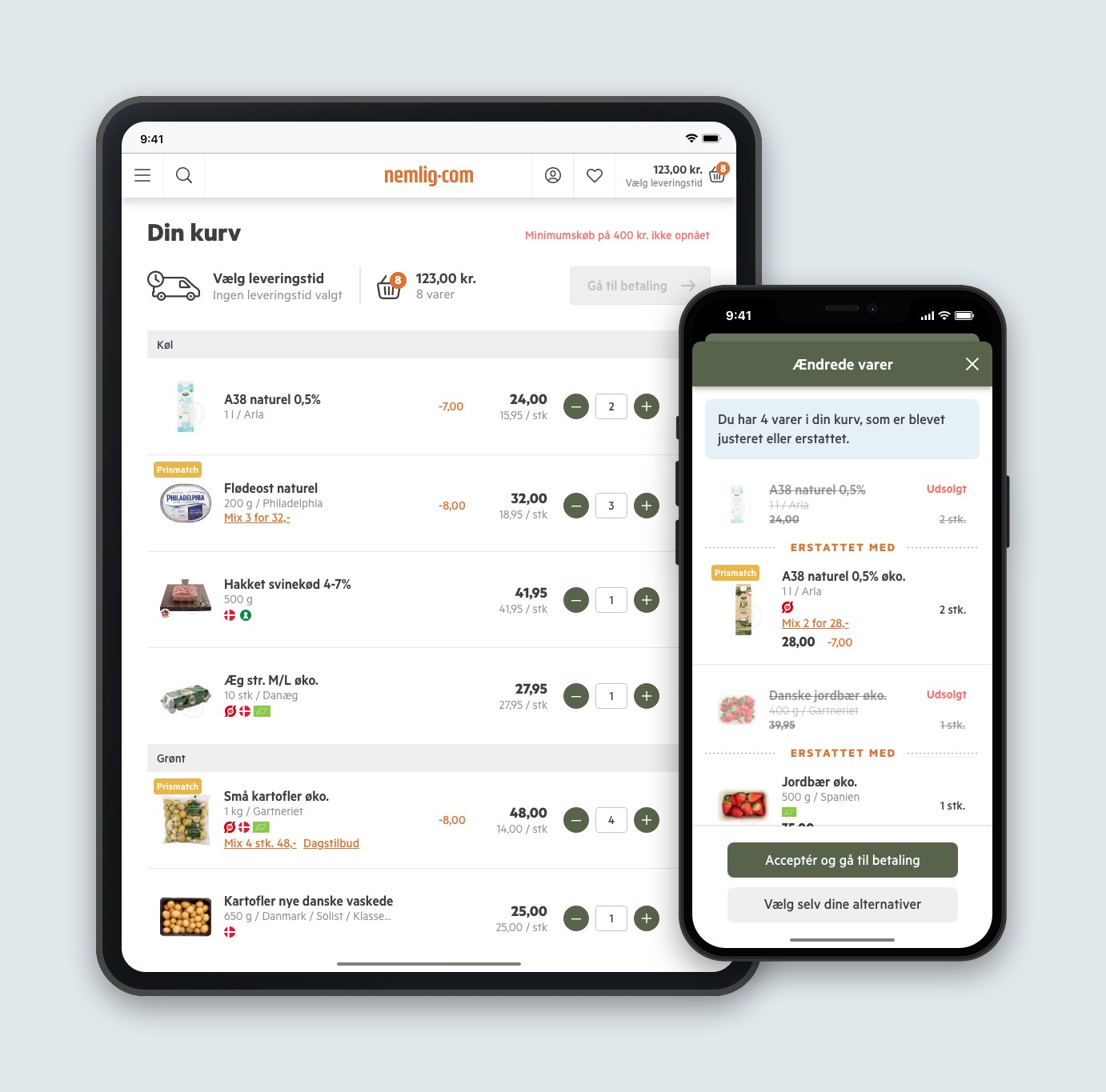
New basket and sold-out products
The basket needed a fresh modern look. On top of that customers were complaining when they occasionally would get a message on checkout about sold-out products and having to go back and find replacements manually. Who could remember the sold-out products? It was a really bad experience, since customers tend to have an open basket over several days where they add products continuiously. Some products may sell out during that time.
Solution
Technically, an already implemented product algorithm for related products was possible to use to suggest alternative products on checkout. I then made a design with a modal so that the customer can scroll through a list of sold-out products and a way to either accept the alternatives suggested by the algorithm or choose one of up to four alternatives themselves. The prototype was tested by some of our most frequent customers and the feedback was very positive. The updated design for the basket featured a prominent element in the top to nudge customers to pick a time slot so that they always get the right prices and a simplified layout of the basket for an easy scan of added items, prices etc.
Result
To begin with the algorithm would suggest to replace a banana with an avocado. But it quickly got it right and the functionality has eliminated most complaints. The remaining complaints are mostly about product avalability.
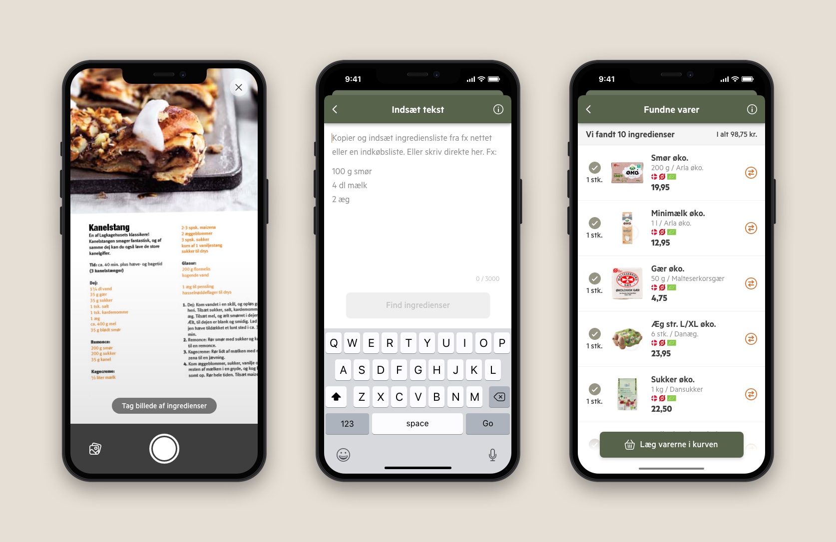
Smart search
A fun little project that came about when the app team had some available time between sprints. We decided to make use of machine learning and algorithms to create a sort of advanced search that would be a quick way to shop.
Solution
The search would be performed by either taking a photo or entering a list of text. As a search result the user would be presented with products to put in the basket. We tested it with users and they were positive about the feature. They were not sure if it would be a feature they would be using a lot, but they appreciated the functionality particularly with turning a shopping list into products in the basket with a few clicks.
However, the sales department was sceptical about placing an icon in the search bar in the top and possibly interrupting conversion. Could the smart search be invoked in some other way like a longpress on the search icon in the tab bar? Would it make sense to place it as a second level navigation item?
Result
An MVP that failed fast! Users quickly forgot about the feature because it was hidden and relegated in the menu structure.
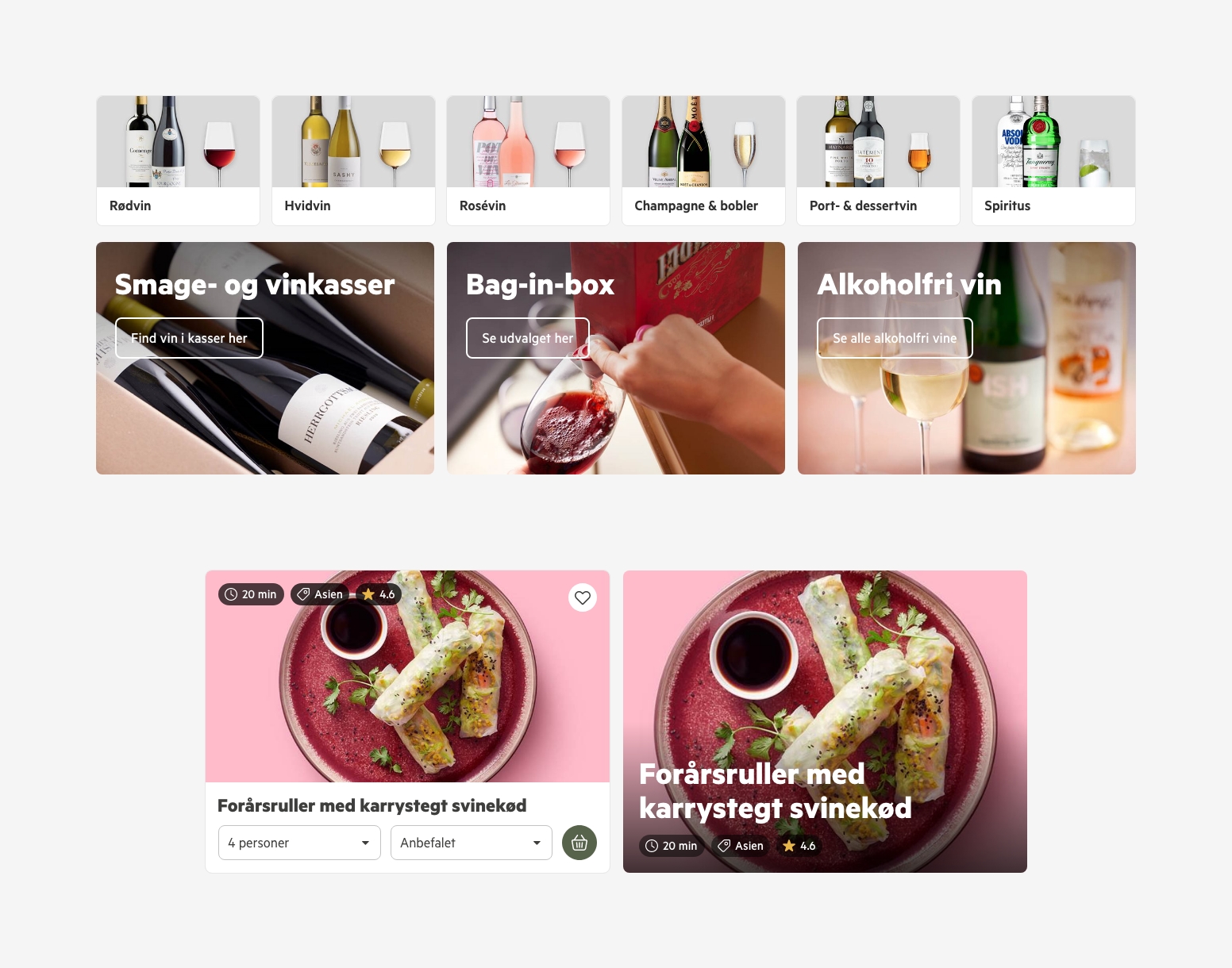
Improvements to various cards. Category entries for easier page navigation and better conversion. New recipe cards with future proofing so that there's room for tags and ratings as well as the ability for the editor to choose a spot version without buying functionality.